Sunday, May 23, 2010
Friday, May 21, 2010
Maspeth is America, Pete Slusarski
I really enjoyed seeing the finished product of your project.The book looks great. The hardcover, standard landscape format worked for your photographs, and the photographic paper really showed them off well. With the 5 x 7 size of each photo, you did not lose any detail, but I wondered how they might have looked if printed larger on the page (especially with more expansive scenes, such as the coke trucks in the parking lot). My only other hesitation was about the dedication page, which seemed to interrupt the beginning of the series. Otherwise, the two single photographs in the middle and the solitary ending photo served as nice breathing points.
As we talked about sometimes in class, it was impossible for you to "photograph Maspeth" or represent it in its entirety, but you really gave the viewer a wide ranging glimpse of this town, including street scenes, backyards, storefronts and interiors, homes, residents, and even pets (the black dog is one of my personal favorites!). Through these images, one can clearly see a strong control of the frame, a symmetry, and deliberate sense of order in your style of shooting.
I know you were also concerned about portraying Maspeth as an ugly place or in some negative light, but I think you accomplished quite the opposite. There is a distinctly quiet, eery beauty in your photographs, whether it appears in the setting sunlight on an old gas station, an empty house filled with balloons, or a garage adorned with lucky horseshoes paired with a dark hearse. Your book allows the viewer to explore Maspeth, as you did while photographing, and to get an intimate sense of how life is lived in this place.
You can be very proud of this body of work. Good luck to you and fellow photographers, and thanks for a great class this semester!
Wednesday, May 19, 2010
Consume Me, by Marti Eisenbrandt
I think that the pictures show a young woman who is struggling to understand and create her identity amidst all of the advertisements and images from magazines that she is bombarded with. Every picture seems to show a different aspect of this girl, and a different part of her identity. The collages seem to be very influenced by the look of magazines and the way that the girl portrays herself in many of the photographs seems as though it is influenced by the type of photography that one finds in a magazine. The choice to make the book softcover, like a magazine, reinforces how important images from magazines are to this work.
I also liked Marti's decision to intersperse a part of Walt Whitman's Leaves of Grass with the photographs. I felt that the text went very well with the photographs and that a lot of care was taken in matching particular photographs with lines from the poem. This made the book flow very well. The poem is somewhat ambiguous, which I felt went well with the photographs. To me, the poem seems to be about individuality and being yourself, which I think is an important aspect of the book. The girl in the photographs seems to be trying to find out who she is and attempting to be that person without apology.
Overall, I felt that this book was very thoughtfully created and I am glad I had the chance to see it.
I hope everyone has a great summer!
Tuesday, May 18, 2010
Art is dead. Marina Abramović (and those of her kind) killed it.

If one day I become a famous photographer, would you take few seconds, minutes, or even hours to sit across from me without being able to move or interact with each other?
That's what The Artist is Present is about. People wait in line just so they can "feel her presence" (and of course the quotation marks are a mockery). What is the point of that? What part of this performance (if you may call it so, because I am personally bothered by it) is considered art (assuming that MOMA embraces its name fully)? Sitting across an artist while engaging in a meaningful conversation is delightful way of spending the hours, but Abramovic's "performance" is no such thing. I don't have to sit across from her to experience her persona. True artists exist in every photograph they produce, and if they don't...well, they failed as artists.
I think The Artist is Present is pointless and a waste of money, not to mention that Abramovic must think too highly of herself (narcissist would be too harsh) to expect people to "feel her presence" (I suddenly feel the urge to laugh).
As of her actual exhibit...A lesser disappointment than The Artist is Present, but a disappointment nevertheless. The nude installation felt out of context. They were poorly pieced together and absolutely not artistic (What's so artsy about a naked guy on a table with a skeleton on top?). I think she tried too hard to create something original (what's original these days?) and she ended up becoming a stereotype.
Robert Frank's "City Fathers" and "Parade-Hoboken, N.J."


Bresson’s The Modern Century reminds me of Robert Frank’s The Americans. Both seem to be concerned with problems of the social classes. Two powerful images of Frank are City Fathers and Parade-Hoboken, N.J.
In City Fathers the subjects are well-dressed, high-class men with their heads high and posture indicating prestige. Parade-Hoboken, N.J., on the other hand, consists of two apartment windows with a flag outside covering half of the image. Two men are staring down from each window. The one on the left looks like the typical common man whereas the man on the right is wearing a fancy jacket. The right man’s face is covered by the American flag. This image is very powerful because it looks as if the photographer is saying "Faceless man behind flag. Common man shows his true face”. Conceptually speaking, from the way the subjects of both photographs are dressed, the type of men Frank calls City Fathers are the same faceless man behind government posts.
Thoughts on Bresson's exhibit at MOMA

Henry Cartier-Bresson’s work takes you into a journey of human ugliness, metaphorically speaking. He successfully targets the upper class directly and indirectly by presenting their luxurious lifestyle as well as by presenting the struggles the lower class faces on daily bases. As I approached each photograph, I noticed that his attitude is somewhat sarcastic. A photograph depicting two Italian peasants carrying a heavy portrait of an “important figure” (in terms of monetary value) is a great metaphor for human life itself. He captured the brutality of the street within an even more brutal frame (such would be the case of photographs of the elite positioned adjacent to the have-nots. The conflict of social classes creates within the frame some sort of collision). Female beauty dies because the “ugly” (tired, dirty, peasants’ faces) becomes the new beautiful. In the photograph of the wall of windows, each window may represent the individuals below and I’m not sure whether the wall is a mockery on the stillness of human life.
Fallen Angels of Your Memory: A Psychological Portrait of Edgar Allan POE
A Review of Arjeta Hyska's, Fallen Angels of Your Memory: A Psychological Portrait of Edgar Allan POE
Arjeta has created a dark and mysterious journey through the psychology of the famous and somber poet, Edgar Allan Poe. Throughout the book, the background colors of the pages are always in flux. In so doing, the images create a collage of sorts within each spread. She has kept the pace of the book, ever changing, giving the reader a sense of how Arjeta believes Poe's psychology was like. With the spreads always changing, the reader is not bored, however, the inclusions of some of Poe's poetry, the reader is forced to take her/his time and sit back, to really decode the author’s intent.
The book is laid out almost as a mystery, a novel that we need to piece together and reorder. But, the beauty of the arrangement of the images and texts is that there can be many understandings on his psychology, and many different conclusions can be interpreted and drawn about what the photographer and what she is trying to tell the readers. With this book we are left with a puzzle that is forcing and asking us to solve it.
Also incorporated through out the book, are a few color images, which surprisingly, sit very well with the other stark, black and white images. There is also a darker sepia toned photograph, made to look like the man walking down the cobbled, wide street was Poe himself, in 1800's America. Which seems to truly embody the atmosphere as a fake portrait of Poe.
This book overall achieves a great balance between the surreal imagery that is used to represents Poe’s psyche, and the incorporation of Poe’s poems. Alongside the added bonus of giving the reader a sense that something needs to be discovered with this book, the book actively seeks this participation.
COLLIDE, Kaisas Peguero
COLLIDE
I felt quite good holding Kaisas Peguero's book, COLLIDE. The look of it is entirely elegant and inviting. The ink black pages are smooth and construct a formal atmosphere. A stream of single images open up the humbling tale and lead the spectator to an explosion of ordinary circumstances. Suddenly, "Vague earthly vapours progress in secret, things slip into silence one by one," (Nerudo). The size of the pages allows close examination without being overwhelmed by gray tones and surprising proportions. The framing induces a friendly suffocation, one a New Yorker knows all too well. The opening page declares a state of nonchalant business and Times Square reveals itself in a somehow intimate way. The blank black pages to the left in the beginning helps the eye focus on the echoing familiarity that would otherwise be perceived as chaotic. The photographs develop in such a way that the overall effect is not chaotic at
all. A progression of details capture the mind's attention which allows sincere focus. Faces emerge and appear familiar, a particular gesture or shadow catches you off guard as if you are experiencing déjá vu. I am reminded of being on a crowded subway and bumping up against strangers- I feel as though I should
be bothered by the intrusion of personal space, but oddly enough sometimes I do not mind.
The artist statement is a singular sentence revealing one fact: Kaisas lives and works in New York City. I agree with the artists' decision to reveal no more than her residence because all that needs to be understood is the ways in which the city becomes intimate and personal. My favorite pages are the final two containing one image focused upward on a boy propped onto his father's shoulders and the other of a man looking out at Lincoln Center. The thread becomes apparent: Although it may seem as if we are entirely alone in our own particular worlds, everyone becomes interconnected by a shared ending, "so that the waves can complete themselves in the sky" (Nerudo).
DAYS' TRAVEL
In terms of layout, I especially enjoyed how several of the left images had a line going across the page, directing your eye into the right photograph. When there was a photograph that stood alone, it signaled me that there were reasons to look closer into the image. I think this change in format forces the viewer to pay more attention to the content of the photographs, and not simply glance over them.
In addition, the afterword was eloquently written, and described the efforts behind taking these photographs.
I very much enjoyed looking through this book. Great job!
Monday, May 10, 2010
Refuge, Five Cities A photography exhibition by Bas Princen

Storefront for Art and Architecture
97 Kenmare Street
10012 New York, NY
Tel. 212.431.5795
Fax 212.431.5755
Opening reception: Tuesday, May 11th 7pm
Refuge, Princen's most recent project, could be described as a photographic fiction of sorts. Although it is the result of extensive travels and research in five cities of the Middle East and Turkey - Istanbul, Beirut, Amman, Cairo and Dubai - it could just as easily pass as the pictorial record of a derive through a single, imaginary city: a city without a center, populated by extraordinary and at times implausible architectural artefacts; an urban laboratory whose physical traits are defined by migratory flows, spatial transformation and geopolitical flux on a continental scale.
An architect by training, Princen has for many years used photography as a tool to observe, record and interpret the contemporary landscape. His photographs - themselves unmanipulated representations of reality - invite the viewer to construct an imaginary landscape that lies beyond the frame, outside the limits of the viewfinder.
Refuge is not, however, an exercise in abstraction. It is a documentation of the spatial products of refuge, ranging from migrant worker camps to gated satellite cities in the desert or the frequent proximity between abject poverty and extreme wealth, that at the same time sidesteps the cliches and the iconic emblems of segregation and seclusion. Starting from its peripheries, Princen's photographs conduct the viewer through a cityscape that is both familiar and remote, ominous and beautiful.
Tuesday, April 27, 2010
David Goldblatt in Conversation April 29th / Howard Greenberg Gallery

Errata Editions and Howard Greenberg Gallery are pleased to invite you to an evening with the South African photographer David Goldblatt in conversation with writer Joanna Lehan on Thursday April 29th. The opening of David's exhibition of the work from his landmark book Particulars will happen that same evening starting at 6pm at 41 East 57th Street Suite 1406. The conversation on both Particulars and In Boksburg will start promptly at 7pm. Pre-signed copies of the Errata Editions study of In Boksburg will be available for sale.
Wednesday, April 21, 2010
Tuesday, April 20, 2010
Book Review: Stanley Greenberg
In his book Architecture Under Construction, Stanley Greenberg photographs that which is scarcely photographed: skyscrapers and other buildings during the skeletal work of their construction phase. The book is composed of 71 large format images, all arranged either alone or with a complement on the opposing page. The book acts as a form of art that is itself captivated by another form of art: architecture. Furthermore, the book focuses on what is commonly believed to be the ugliest part of architecture’s creation, its construction. Whereas a painting or drawing may look beautiful at any phase through completion, structures being built are often associated with danger, dust, and loud, piercing noises. Greenberg points out the beauty he can find within this phase of art in the making.
Greenberg seems to be fascinated with the skeletal aspect of these structures. He never photographs barren, empty foundations, nor does he photograph the project as it nears completion. He instead focuses on the harmonious (but often sometimes extremely chaotic) intertwining of steel beams, the molding of concrete to encase the floors or “skin” of these buildings, and the scaffolding, which seems to fill up all empty space within.
Greenberg’s subject matter was well staked out ahead of time. Due to the nature of his medium, hundreds of snapshots of the sites were not practical. Timing was key, and this is where light comes in. The light in each of his photographs is well thought out. Greenberg estimated the optimal time for the sunlight he desired, and came back later on in the day. The extensive use and play of shadow is rare in his photographs, and the light from the sun is often straight on. His
photographs hint at this patiently planned out method of taking pictures.
The absence of people in his work hints at the fact that Greenberg was more interested in the aesthetics of these structures rather than the workers’ interactions with the architecture, the construction process as a whole, etc. This book is not a documentary, but rather an organized collection of aesthetic amazement.
Greenberg’s photographs are usually taken of a field of crisscrossing ironworks, or organized perpendicular lines. He loves to toggle between the two, between this organized sense of structural math and order, and chaos that contains great depth. None of his shots are taken at short-range distances, and are often taken of several components together from a large-scale point of view.
As a final note, I found Greenberg’s afterword very interesting and fitting for his book. It is structured exactly how I imagined his day would be like -- frantic, interrupted, and misunderstood. I found it to be a very appropriate ending.
Although this wasn’t an exhibit I’d normally be interested in, I wanted to write about it because it’s something I’ve never really explored or fully appreciated. Nonetheless, I thought the goals and experiments of the exhibition was very interesting and thought provoking (most often, after I had read the placard, I must admit). Anyway, the work I saw was the Surface Tension modern photography exhibit at the Met. It was a rather small exhibit of about 25-30 pieces. There were a few I jotted down that caught my interest.
The piece I was most interested in was Chris McCaw’s Sunburned. McCaw builds custom large and medium format cameras, loading standard size photo paper in lieu of film. For almost the entire day, the four prints scorched a path in the paper, and beyond this you can thinly make out the landscape of the mountains in the desert. He exposed the paper on the winter solstice, the day in which the sun follows the shortest path in the sky. I thought this was a really interesting piece. At first glance it looked like complete garbage. I throw away messed up photo paper in the darkroom that looks cooler than this. But after I understood the goal, and recognized that the discoloration in the background was in fact mountains, I really appreciated the piece a lot. I love how in an increasingly digital world, some artists still create their own film cameras and use them to interpret and record light in their own unique ways.
To the left of McCaw’s piece was a photograph by Daido Moriyama. Although I didn’t think it was one if his best works, I thought it was cool to see Moriyama’s work in an exhibit like this, especially since I’ve been looking him up a lot over the past month or two. I have to admit though, I don’t know how well his piece fits into the exhibit...
In the corner of the space was an enormous twenty-by-six foot photo mural of a concrete slab of freeway surface. The artist, Miles Coolidge, photographed a portion of the Santa Monica Freeway designated as an Accident Investigation Site, hence the title of his piece. The photograph was taken at a 1:1 scale, pointing out literally every imperfection, cigarette butt, crack and detail of the road surface. This is truly a great example of the photographer’s primary role, to point. And that’s literally all this piece does. As simple (and almost unoriginal) as it was, I really loved the way it was put together, and the concept behind it. Think about how many hundreds of thousands of motorists pass over this site each day, none of which take any notice to what Coolidge is pointing out. Of the entire freeway, this definitely had to be the most interesting portion of highway in terms of defect and detail hidden within.
One piece that got me thinking was Marco Beuer’s Spin. The concept was pretty straight forward: Breuer placed a sheet of exposed photo paper on a turntable, and allowed the record player to scratch through the layers of the paper. The placard noted that Breuer uses no cameras, lenses, film or enlargers in his “photography.” I found this interesting. Is this photography? Breuer’s not really playing with light in this piece; he’s playing with chemicals. I’m unfamiliar with any of his other works, but the mention of his work as photography got me thinking as to what exact point the word “photography” can no longer be used. In my opinion, this is one of those cases, although I’d be interested in hearing an argument otherwise.
Robert Adams Book Review: The New West
Robert Adams’ book The New West: Landscapes Along the Colorado Front Range caught my interest from the first few photographs. By the time I had finished his work, it was clear to me what Adams was expressing: his viewpoint in regards to the turmoil we have put the once “wild west” through. Adams divides his book, which contains fifty or so black and white photographs, into five sections labeled Prairie, Tracts and Mobile Homes, The City, Foothills, and Mountains. Each section guides his journey through the Pikes Peak region of the Colorado Wilderness. Each photograph occupies the right page, while a complementing word or two about the photo and its respective location lie on the left. It was obvious to me that these simple, at first innocuous captions were something more. They very, very subtly contrasted man’s creations with the natural landscape they are effectively destroying.
Prairie seemed at first as a romantic tribute to rural transportation. Here, man is not seen. His creations seem to compliment the landscape, or at minimum, seem unobtrusive. Some roads are unpaved, others are rolling landscapes with telephone wires running conspicuously through the sky. Then suddenly, more telephone poles -- a For Sale sign. The next image is a dead rabbit on hot asphalt, its innards graphically spilling from its sides. It is noticeable that the greenery is growing sparse -- a lone shrub grows painfully out of a rocky roadbed. Man has clearly claimed the land by the end of this chapter. The descriptions at left seem to mock this “description-of-my-vacation-pictures” type set up.
Man moves in. The opening image of Tracts and Mobile Homes makes this clear. Barren, level plains are for their exploit. They begin to create these homes. Even as they near completion, as Adams suggests in his captions, the restoration of wildlife and shrubbery is vacant. The dirt remains instead. One image contains a STOP sign, at the center of the composition -- deliberately chosen by Adams. Adams uses words sparsely yet powerfully in his photographs, so that they convey a powerful message without becoming convoluted. Interesting in this section is Adams’ use of two images from almost identical locations of a “subdivision in Arvada.” The latter of the photographs is ridden with dark, ominous clouds overhead. The chapter ends with Adams’ caption, “dusk,” with the image of what appears to be a real estate sign alongside the road.
The City is where it all grows cold and dead, as far as wildlife is concerned. Adams remarks at the opening of the title how nothing is forbidden. One image even shows people shopping within a drugstore, a sign ironically hung over them that reads, “CAMPING NEEDS.” Camping needs. In order to flee the poured concrete and destruction that their fellow man has laid, yes, maybe one needs camping. Miles and miles of concrete, parking lots, and gas stations flood Adams’ most important chapter.
Foothills finds the reader retreating from the inner city, back into the city limits. Here, man is still at work, but in a different setting. It appears that the reader is seeing man interact from a bit further back. He builds long fences to keep his few cattle from roaming (which, as the title suggests, are for sale), his highways are guided and formed by the natural terrain. A house sits in a field of plains, his homes, gas stations and motels all contrasted by the ominous landscape -- giant, silhouetted mountains behind them. His creations are small when viewed from this perspective. Perhaps the most interesting image in this chapter is one of a darkening sky, a lit gas station with the bold words FRONTIER on top of it, and a barely noticeable mountain silhouetted behind it. The caption only reads, “Pikes Peak.” It is clear at this image that Adams is using his labeling scheme to somehow mock man’s creations and his relationship with nature.
Mountains is brief, and closes the narrative through the Colorado landscape. The first image shows a curve in a highway, and signs for the purpose of guiding automobiles and creating a sense of order. Next comes “vacation homes,” scattered arbitrarily amongst heavy boulders that heave seemingly toppled down the mountainside. How have they not crushed flat these homes? Nature is starting to reclaim its domain -- a small billboard and telephone wires are found consumed by heavy foliage along a creek. The final image in this short, four-image chapter is that of a mountaintop on a clear day, with a cemetery in the foreground covered by a dark shadow. This image can be inferred as man’s inevitable decline; nature will always reclaim the land man takes, as man will inevitably die, leaving his land and possessions for the immortal landscape to consume.
Daido Moriyama
Hi everyone, sorry it took me so long to post on here . . .
Anyway, in late February, I went to the Luhring Augustine Gallery on 24th Street in Chelsea to see the Daido Moriyama exhibit. Moriyama is a post-World War II Japanese photographer that photographed and developed with extremely high contrast, popping grain tremendously to often create a lifeless, ominous feeling. The shadows his subjects create are often true black, and coalesce with the subject to morph it into a unique, unidentifiable figure.
The exhibit was divided into two parts. The front and larger of the two rooms displayed Moriyama’s photos from a trip to Hawaii. The second room displayed smaller-scale versions of his past work. At first I thought the front “vacation” portion was a bit strange -- strange that he would display vacation pictures that contained images of typical Hawaiian tourist photos of volcanoes, airplanes, palm trees, pig roasts and the like. However when I came back to this part of the show, I viewed the photographs more objectively, and really started to appreciate them for what they were and how they were presented. The reasons why I initially disliked them was most likely why Moriyama had taken them. He wanted to take trite, typical vacation pictures and present them through his unique lens. Hawaii is obviously a popular relaxation spot, but after Moriyama processes his images, they seem to take place on some eerie, lifeless planet. The refreshing surf becomes thick oil. The sand becomes a featureless concrete floor. Palm trees look like nothing you’ve ever seen before. (Of course, this is to exclude one piece I think kind of ruined the set . . . a dog with sunglasses on and money hanging out of his mouth . . . just didn’t do it for me...)
My favorite pieces were in the back room. Purely out of interest and not really attributing to technical ability, I really loved his transportation shots (including one or two in the front as well). I think Moriyama has a love for graphic design, as his photographs of signs and text suggest. The image of the streetlight against the texture of the ocean is, I believe, a great example of his style. Moriyama loves taking the typical, and morphing it towards the realm of unrecognizable. He isolates the common object, occurrence, landscape, etc., and alters it in a way that we see it from a completely new perspective. Grains pop where smoothness belongs, sense of day and night is completely removed, and small features that give character to the subject are blown out by the contrast to create a sense of shape, as opposed to unique object.
I definitely liked his photographs that he shot in Japan the most. It is obvious to me that he feels most comfortable here, and has a strong sense of unity with his subject matter. He appears to focus on culture and personal interactions, and present them from an almost post-apocolyptic point of view.
Something from the gallery's website:
http://www.luhringaugustine.com/index.php?mode=past&object_id=227
Monday, April 19, 2010
Henri Cartier-Bresson exhibition at MoMA
Hey! I'm going to see this on Friday, but just thought I'd let you all know about it now, and I'll write a little something later.
Henri Cartier-Bresson: The Modern Century, at MoMA (now through June 28th)

Friday, April 16, 2010
Cool site
Thursday, April 15, 2010
Thomas Roma
Anyway, I was searching for some articles written about Thomas Roma and I thought this particular interview from Museo Magazine really helps sum up what the lecture was all about for anyone who didn't get to go. He was hilarious- it was like a breath of fresh air to hear someone speak their mind so openly and intelligently.
THOMAS ROMA
Interview by Alex Klein and Bettina Shzu
Thomas Roma has photographed extensively in his native Brooklyn, focusing on everyday life, as found in churches, subways, streets, public pools, and elsewhere. He has had solo shows at The Museum of Modern Art and the International Center of Photography and has produced numerous photography books. Roma is a professor of photography at Columbia University. This interview was conducted in 2000 by two of Roma’s former students, exploring his pedagogy as well as his art. It was originally published in the fourth volume of Museo
Alex Klein: How did you start working as a photographer?
Thomas Roma: Just like anyone’s life story, mine has many versions, and I’ll start with a medium-length version. I was a trader on Wall Street on the floor of the American Stock Exchange from 1967 to 1971. In 1969, when I was nineteen, I got into a serious car accident. I hit three double-parked garbage trucks, was thrown from my VW Beetle, and sustained a serious head injury, which is a totally mundane, unremarkable event unless it happens to you. My rehabilitation in the very beginning had to do with not moving. I couldn’t lie down because of the excruciating headaches, and I didn’t have the attention span to watch television or read, so I would sit up and stare out the window.
One day, my older brother Joel came to see me, and he had a camera. I asked him to get me one. He later sold me his for thirty-five dollars, and I started photographing out the window. A few weeks later, when I was able to move, I was taken to an old department store and got a home developing kit. Something about my first pictures didn’t look right, but I kept doing it, and then, a couple months later, I bought a little enlarger. When I went back to the Stock Exchange, I started buying better equipment and bought a better camera. It turned out that my first camera was broken all along, which accounted for some of my failures. When I told my brother that later, he mumbled, “I know.” I asked him why he had sold me a broken camera, and he said that he didn’t think I’d pull through. So, I first got involved with photography by accident, and the first person I dealt with had no faith that I’d continue doing it. It seems that a lot of things start that way—by chance—and then, they become your life.
Although I was making a lot of money on Wall Street, my interest in photography was reaching a critical mass, and I couldn’t continue to do both. I realized that I aspired to something else. I was overwhelmed by photography, even though I was so bad at photographing. I ended up taking a job as a darkroom technician and teaching assistant at Pratt Institute. I left my job on Wall Street to do that, thinking in the back of my mind that I could always go back. I met some great people at Pratt, and they introduced me to other great people like Garry Winogrand, Lee Friedlander, and Walker Evans. But I never showed anyone any of my photographs—not until 1973 or 1974, after I’d done a body of work with a camera that I’d designed and built myself. I saw in Camera in Paris that Brassaï had used a medium-format camera that wasn't made anymore, and I decided to make a modern version of it.
Bettina Shzu: How did you do that?
TR: At Pratt, there was an engineering school, and there was an old technician who kept dozens of lathes and milling machines in perfect condition. No one ever used them anymore because engineering had moved beyond them. He helped me fumble along with machines, and I learned enough to make my first camera. Later, I taught myself to do mechanical drawing from US Navy manuals, and I worked in other machine shops, sweeping the floor, watching what they’d do.
AK: A kind of hands-on learning?
TR: I learned by watching people. Ignorance is such an important part of life. How many times have I told my students to try not to know so much? If you think you know something, you’re finished with it—there’s nowhere else to go. I didn’t know how hard it was to make that camera. If I had known, I never would have tried to do it—that would have been crazy. I would have compromised and made something less good, but instead, I made the exact camera that I wanted, the exact camera of my dreams.
BS: Which was?
TR: A lightweight, three-pound, hand-held camera that I could hold up to my eye that made a rather large negative, a camera that worked very quickly, basically a modern-day press camera. Then, people saw my pictures, and they wanted cameras, so I borrowed some money and went into business manufacturing cameras.
AK: How about your photography back then?
TR: I approached photography the only way that I knew how to approach anything: as a job. I would get up, photograph all morning, stop and have lunch, and then, photograph all afternoon. I didn’t think that I had to wait for some inspiration. Emily Dickinson and Ralph Waldo Emerson seemed to write about what was going on in their lives, and I wanted to do something similar in photography. I never questioned that what I wanted to photograph was the actual stuff that made up my life, what shaped me. So, I walked around Brooklyn and photographed, and things would occur to me. I was also trying to unravel what I thought was this musical language, listening to a crescendo in Mozart, and trying to find a visual analogue to that, seeing the world as having multiple things going on, folding into each other, and still being as clear as Mozart’s music. Like listening to a piece of music, you might only be sensitive to certain things in a photograph at certain times, with different viewings allowing different meanings. I wanted to make something that was complex enough to stand more than one reading. I wasn’t interested in making jokes or illustrations. Straight photography, following the medium, is intoxicating—trying to wrestle it into the form of a poem.
AK: Were you in dialogue with the street photographers?
TR: Not a dialogue, because a dialogue happens among equals, and I was not an equal, nowhere near. I looked at everything that they did, and I did provide them with something too—the tremendous energy of someone who was paying attention. I insist on teaching Photo 1 every semester because I want to be around people whom I have to strain to explain things to.
BS: Could you talk about your philosophy on teaching?
TR: When I first started doing some teaching at Yale, I realized that I had a decision as to whether I would train people in what I knew (but I didn’t really know what I knew, because that was never really useful to me) or find a way to engage my students in my practice. I thought training had to be bad because it would be limited to what I remembered that I knew. I thought that the one thing that I could do would be to bring my own investigation to the class. So, I tried to explain what I was trying to do in my work and asked people to do that along with me, the only thing separating us being that I had done it longer.
AK: People come out of your class with an ability to approach their own work as if they didn't make it themselves.
TR: I think that’s because we don’t first discuss the photographer’s motives or intentions. We only discuss what the students have done, looking at it with a cold, analytic eye. Allowing your unconscious to inform your actions and then looking at the results of your actions is exhilarating. I don't want you to say, “I wanted to do this.” After that, what’s left to say?: “You didn't do it” or “you did it.” If you have a dumb idea and you succeed in doing it, that’s not success. I could understand the attraction to trying to illustrate ideas, but I believe it’s more fruitful to allow yourself to respond to the world, at least in Photo 1. In my own work, I still allow myself to be interested in the world, knowing that just being present with a camera often changes everything around me. I’m interested in looking at the world in a new way because I have this awesome machine in my hands. Imagine what Masaccio or Leonardo would have done if they had an instrument with which they could point, push a button, and get an image. Of course, it’s very frustrating to a lot of people because we make masterpieces and rough sketches with the exact same physical gesture.
BS: Could you tell us why it is that you portray yourself as being anti-theory?
TR: We’re in the presence of what’s probably the greatest Art History department in the country. Why should I be a minor-league version of the people who do this full-time, who I admire tremendously? You cannot tell from my photographs or from the way that I teach what my appetites are. It’s very common that a jazz musician will know about, consume, and even be passionate about classical and country music, but play only jazz. For some reason, that luxury is not afforded people in the visual arts. I’m interested in all of it, including theory. What I’m against is being confused or paralyzed by theory.
BS: Do you find that you learn from your students?
TR: I think that that’s mostly false. More importantly, I remember things that I know, things that I wouldn’t remember if I weren’t teaching. But if I’m in Photo 1 class and I’m actively learning, we'd all be in trouble. I’m aware that in the beginning, there can be something unsettling about my class, in that the students are free to create the agenda. I give no assignments. In fact, I actually give a list of things not to photograph because they’re traps and the’yre just a waste of time: no mimes, no cats, no bicycle wheels in the sun casting a shadow, no fire hydrants with snow on top of them, no babies, no old people, don’t go to Chinatown and photograph fish or ducks hanging in the window. And I ask people to be sensitive to certain racial and ethnic things, to not photograph the Other. This is not a safari where you’re going around looking for the exotic. I find that it’s much richer to point the camera within the world you occupy.
AK: Where are you right now in your own projects?
TR: I have a bunch of books that are finished or almost finished. I’ve been working in the book format for a long time now. For one project, I’ve been going through every photograph that I’ve ever done, then I make selections for my nine-year-old son, and he chooses photographs to write about. He’s written about thirty-six pictures, and now, he’ll write about the experience of doing it. So it’ll be his book. The working title is You Come Too after a Robert Frost poem. But now, I’m really stretching myself. I’m photographing in ways that I never even imagined I’d photograph, and I have tremendous energy and appetite for it, which is informing my teaching. For example, I went to my machine shop and built a counter-weighted arm that floats my camera up to the ceiling and looks straight down. “What can I photograph from the ceiling?” I thought. “What does it look like after people get up in the morning?"” “Don't make the bed,” I told my neighbors, “I'm coming over.” Or, what does it look like when people are preparing a meal? Or when a kid is doing homework? I’m still learning where the frame ends, so I’m a beginner, and it’s exciting to think that I’m letting go of looking through the camera and that I'm giving more over to photography and the world. This technique keeps me from making pictures that I already know how to make. A nice thing about photography is that nobody knows who you are. Even achieving a certain amount of success doesn’t make you aloof from the world, or from the necessity of earning a living or reaching out to people. The lottery was up to 100 million dollars when I was photographing my book Higher Ground, and my brother Joel asked me if I bought a lottery ticket. “No,” I said, and he asked, “why not?” I said, “I don’t buy lottery tickets because I don’t want to win.” “What do you mean? You don’t want to win?” he asked. “Well,” I said, “I don’t want to hope to win. I don’t want to be in the condition of hope because hope is a condition of the last resort. As long as I can keep making everything I want, I don’t have to hope for anything. What would I do with all that money? What would I do if I had 100 million dollars—photograph from a limousine instead of from a train? Would I hire someone else to take the pictures? What good is that money?” What’s more interesting than your own life? Yes, it’s a struggle. And yes, when you do something dumb or expose yourself as someone with yearnings or fears, people are going to see it, and frankly, nobody wants to do that. What everyone wants to do, especially in a university, is let everyone know how smart and resourceful they are, and I can’t blame them, but it just has nothing to do with making art, as far as I’m concerned.
http://www.museomagazine.com/10/roma
Annie Leibovitz: AT WORK
I know, I know. I chose two fashion photographers to review, but I will
sincerely say that this particular book has aided me in becoming a more diverse
photographer. The book is written in first person, narrated of course by Miss
Leibovitz herself. The book contains 197 richly printed color photographs,
highlighted with valuable information, culminating into 235 pages. The text in
“At Work” is entirely different than the text in “UNTITLED 116.” The content
describes the photographer’s process, serving more as a documentary. The
details given are not necessarily technical. Leibovitz quotes Arnold Newman
saying, “…Photography is one percent talent and ninety-nine percent moving
furniture.” Annie Leibovitz is infamous for her obsessive compulsive nature,
even more so for her insanely expensive photo shoots. It is ironic that she
humbles the importance of equipment and focuses directly on her subjects
throughout the book. The photographs are divided into chapters such as
Conceptual Pictures, Groups, John and Yoko, and Nixon’s Resignation. Each
chapter taught me why photography is interesting; The circumstances are
always different, the places are always changing, plain and simple. You see the
world through a frame, and once you learn to see, unordinary circumstances will
allow creative perfection.
The photograph that inspired my fascination with the medium is entitled
“Natalia Vondianova, Stephen Jones, and Christian Lacroix, Paris 2003.” The
image is, but of course, from an Alice and Wonderland-themed Vogue photo
shoot. Designers were incorporated as characters and stars one of fashion’s
beloved supermodels: Natalia Vondianova. I learned how compositionally a
photograph can be complex, but in order for the subject to translate the frame
must contain a simple structure. This viewing was not my first time seeing the
spread; I had seen it in Vogue when I was only 14 years old. Seeing the image in
a book altered the image’s reality. I see it now as a moment in fashion history
instead of a glimpse of fantasy. Seeing photograph’s from fashion magazines
re-bound into a hardback coffee table book makes the images seem more
important somehow. Leibovitz comments on details such as how she had to
consider the gutter of the page when placing her subjects. The chapter, “The
Rolling Stones,” reveals portions of the photographers work for Rolling Stone
magazine when she toured with the band. She made the job seem so easy and
claimed that she barely knew a thing when she set out on the assignment. I wish
the 1970s Almost Famous era hadn’t ended- it was so easy for photographers
to gain access. A recent graduate being able to spend weeks with the Rolling
Stones? Such luck is unheard of because photographers are not trusted
anymore. Another interesting focus of Leibovitz’s is her emphasis on gaining the
subjects trust. No one is going to want to show anything to you if you seem
uninterested. The chapter on Arnold Schwarzenegger shows the then body-
builder naked in a hotel room with his friend. Another chapter shows the most
famous photograph the artist is known for: The image of John Lennon and Yoko
Ono taken the day John Lennon was shot. Leibovitz talks about how she was
only sent to take the picture because she was the cheapest option. Yoko Ono
told her later that she was impressed that Rolling Stone let someone like her
photograph people who were so famous. She asked them to take their clothes
off and pose nude in an embrace. Yoko refused to take her pants off, but John
said having Yoko on the cover was really important. That night, John was shot
when returning home from a recording session. Photography is a series of
instances that mutate into a single result.
I always come back to this book because it is interesting. The text’s only
purpose is to give background information. In order for background information
to be relevant, the reader must be interested in the photographer. I am learning
that a book is different than a magazine or exhibition because the images offer
an intimate explanation of the photographer’s intent. I do not plan on giving
outside details about my photos in my book, but I want people to sincerely
enjoy looking at it.
Walker Evans, “American Photographs”
Lincoln Center- Quinn Library
TR 653 .E78 1975 Copy 1
East River Press New York, 1975
With an essay by Lincoln Kirstein
Reprint of the edition published by The Museum of Modern Art
Copyright September, 1938 by Walker Evans
1903-1975
Part One and Part Two consist of 90 photographs.
The book is 192 pages.
My favorite part I when Kirstein discusses the innocent amusement in practical
exploitation in photography, and its need for human judgment and creative
selection.
Peter Lindbergh: UNTITLED 116
Contemporary Issues in Photography
14 April 2010
Book Review
PETER LINDBERGH: UNTITLED 116
I received a copy of Peter Lindbergh’s “Untitled 116” as a Christmas gift this year. I was a bit taken aback when I first glanced through the pages because a majority of the book is written in German. I was forced to question if not being able to read the quotes beside each photograph would alter how I engaged in the photographs themselves. Peter Lindbergh is an interesting character, notoriously claiming he ‘was not in the least bit interested in photography,’ until the age of 29 when he picked up a camera in 1971. Fashion Photography is my favorite flavor of the medium when it comes to books; the artists tend to sequence the photographs intuitively, allowing a dose of magic to thread together nonsensical details. Untitled 116 was created by a fashion photographer, but the photographs are not at all fashionable. The book united 207 images of 116 women, celebrating the personality and individuality of Lindbergh’s favorite models.
The photographs are printed beautifully in black and white, although each page contains a different size photograph positioned randomly. I suppose this might reflect the specific nature of each woman. I had to sit and look through the book around ten times before my eyes and thoughts could create some sort of friction, ultimately leading to an imaginative narration that threaded a clear understanding of the photographer’s appreciation for women. Not until I sat down to write this did I notice a pamphlet stuck into the very last page containing a translation of the text injected into white spaces beside random photographs. Subjects such as Amber Valletta, Kate Blanchett, Brittany Murphy, Anna Nicole Smith, Esther Canadas, Julianne Moore, and Helena Bonham-Carter represent truly beautiful women. I know, ‘truly beautiful,’ sounds phony, but these photographs are not glamorous. The women are all dressed casually, absolutely no makeup, immersed in a comfortable environment and willingly expressing themselves to the camera. Immediately John Berger comes to mind; Are these women still posing, still perfecting their gaze for a male spectator? The photographer is male, however I become obsessively engaged with how the women compose themselves for these shots. Each being high profile celebrities, it isn’t hard for them to please an audience. The point is, they aren’t pleasing anyone but themselves. Although they are my least favored set of photographs, Anna Nicole Smith’s 5 photographs (one of those most pages given to a single subject) are the best example of the non-posed composure I am trying to explain. The first photograph shows her on the beach, hair loose and wavy, wearing an oversized men’s blazer. She is staring to the left of the frame while she clutches the breast of the blazer together very tightly, covering the only area where her skin would be exposed. The next page displays a vertical full body shot, where she is playfully striking a Marylin Monroe pose and smiling like a child. The quote beside her is by Federico Fellini, titled “Fare un film,” (Making a Film). The quote is too long to write out here, but on section states, “…Others aim to surprise you, they manifest themselves in the exuberance of certain companions who jokingly disguise themselves so that you do not recognize them; their vitality is violent, contagious…”
I am glad I did not see the translations before I fell in Love with this book because I wouldn’t have probed and searched for a meaning myself. I would have simply looked at the photo, looked at the text, and allowed myself to stop in the tracks of the aura of romanticized quotations. That being said, the text can serve as some form of guidebook, like cheat sheets for a video game. I am able to daydream a story about each woman using the words of Leonardo di Vinci, Peter Handke, James Joyce, and others. The words add a finishing act, and help me realize using a quote that doesn’t empirically explain the content of my final project is perfectly acceptable.
Wednesday, April 14, 2010
Book Review: Camera Obscura
Camera Obscura

I felt that these photographs were very interesting and that they were concerned with the relation of the outside and the inside world and the contrast that sometimes exists between them. In the photographs of his home, for example, the outside world seems to come inside, into the private world of his home. In one photograph, the houses across the street from his bedroom are projected onto his bed and the wall above it. Having the outside intrude on what is usually the most private room of the home shows how people live a private life, behind closed doors, and a public life outside, and how these two sometimes overlap, often in ways we don’t want them to.

Many of the other photographs show famous monuments, such as the Eiffel Tower and the Empire State Building, projected on the walls of bland, ordinary hotel rooms. These hotels are the kind of places one might stay at during a vacation to view a famous building or monument; however, they seem insignificant when compared to what is projected on the walls. This shows a contrast between the real world of the hotels and the fantasy world of the monuments. Although someone may visit a famous sight, it is really only a fantasy that one participates in for a short amount of time. No one lives his or her life in the Eiffel Tower. At the end of the day a person has to live a real life in the boring rooms and offices that these places are projected in.
I think that these pictures also show a concern for what is real and what is an illusion. The picture of the Eiffel tower, for example, is especially amusing, as the Eiffel Tower is projected right next to a framed drawing of the Eiffel Tower. The sad-looking print of the Eiffel Tower is no match for the real one projected next to it, however, they are both, in a way, just pictures of the Eiffel Tower. I think that this is a clever play on what is real and what is an illusion, since although the projected Eiffel Tower seems to be the “real” one, it is actually just an illusion while the picture, though just a representation of the Eiffel Tower, actually exists in the room.
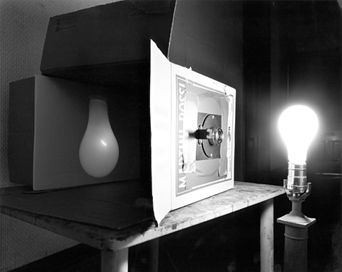
I think that these photographs are also about photography itself, since they are in a way photographs of photographs. In my favorite photograph in the book, for example, a light bulb is projected into a box that has been turned into a camera obscura. The photograph shows the entire setup, including the light bulb outside and projected inside the box. I think that this picture is an original way of taking a photograph of a photograph, since that is what the image projected inside the box essentially is. It is also a photograph of an object that produces light, which is what makes photography possible. I think that this photograph is really about photography in a way that is very original.
Here is a link to Morell's website which shows many of the pictures from Camera Obscura. On his site he also includes some color camera obscura pictures which were not in the book but are very interesting.
Book Review: Medebach
Medebach: Photographs 1979-1983
One of the books that I chose to read for this assignment was Petra Wittmar’s Medebach. This book was comprised of about sixty black and white photographs taken in Wittmar’s hometown of Medebach between the years 1979 and 1983. The book was slightly larger than 8x10 inches, and included an introduction and an interview with Wittmar. None of the pictures in the book faced each other; each photograph appeared on the right side with a blank page to the left. The photographs in the book are mostly of buildings, although these are broken up by occasional shots of interiors. The way that the photographs are framed is very interesting; nothing is photographed from directly in front of it or is placed in the center of a photograph. Rather, buildings are almost always seen from the side and from down the street. The framing is very deliberate, but almost appears haphazard: buildings and objects are often cut off at the sides of the photographs and things seem to jut into the photos at strange angles. Things are also often blocked from view by other things and empty areas often appear in unexpected places in the photographs.
I think that this unusual framing shows a concern for how things are placed in a town and how they relate to each other. Nothing is photographed in the center of a frame, as though it were by itself, because no building or object in a town can exist in isolation, independent of its surroundings. By looking at an area from a different vantage point than would normally be used and by including things in the frame that would normally not be included, Wittmar forces the viewer to consider buildings and objects, and even empty spaces, in relation to each other. In fact, it seems that it is the empty spaces that are the most important parts of many of the photographs. These empty spaces are the connective tissue of the town and hold everything together. The unusual vantage point of the photograph forces the viewer to see this. In viewing many of the photographs I found myself wondering why Wittmar had chosen to stand where she did, since it did not seem like the correct place to stand. However, I started to wonder why I should feel that there was a “correct” place to view things and why one viewpoint should be privileged over another. Why isn’t the view from beside, or behind something just as legitimate as the view from where one would normally stand? It is this view of a city that forces one to look at it in a different way and to see how objects that normally would not be considered together relate to each other.
Although Medebach seems bland Wittmar uses this indistinctiveness to show what these small towns that seem perpetually stuck between the past and present are like. The photographs appear to show a place that is in a process of change. Many of the pictures feature Tudor-style buildings that seem somewhat out of place compared to the strikingly bland newer buildings that are beginning to dominate the landscape. At first these old-fashioned buildings seem interesting, but after seeing many photographs of these buildings, it is clear very quickly how repetitive they actually are. In fact, the longer one looks through these photographs, the more alike all of the buildings begin to seem. Eventually it becomes clear that some buildings actually appear in multiple photographs, but from different angles. After a while, however, one begins to question whether certain buildings have actually been photographed more than once, or whether they are just similar to buildings that have already been photographed. The way the buildings begin to bleed into each other shows the repetitiveness of living in a small town where one has seen everything more times than he or she can count.
Kaisas' Book Reviews
Mark Steinmetz book is the story of the south east states of America. It is following in the steps that Robert Frank took across America, but Steinmetz has taken the different regions and published them in separate books of the series. He differs from Frank his work is less about the American culture but on the relationships between people, and people and the camera. The book is roughly 10x11inches and vertical. The photographs, however vary in sizes, while most are 6x5inches, others are a bit bigger. The book is white with a close-up of one of the images in the series, is black and white, and has an introduction by Peter Galassi.
The outside appearance of the book emphasizes the photographs message as a whole. There is a somber and curious mood throughout the books. Steinmetz touches on the poverty, the simplicity, and the heartache of the southeast portion of America. The portraits, are juxtaposed to random landscapes, sad landscapes. Photographs like that of an old abandoned car overrun and hidden by old vines and grass and covered with early morning mist and fog in the background are included to showcase how the subjects and these landscape and objects connect. It is up to the reader to make the full connection. The images are haunting and subtly direct. The subjects are looking away from the camera as if caught daydreaming, while others show their shyness to camera. The looks and the act of hiding from the camera that the subjects show are at the core of the message behind Steinmetz’s work.
The way the subjects look or don’t look at the camera, the way the light hits the subjects, illuminating their features, highlighting them and their expression is what this book is about. From these elements, we know that we are looking at encounters the photographer had. There is a sense that these are not staged, or not exactly pre-arranged, events but true emotions, looks, people of the southeast. The book lets us, if only for a few minutes, get in touch and get to know these subjects, perhaps as the photographer did.
Review: The Park by Kohei Yoshiyuki
I have never seen any of Yoshiyuki’s work before seeing his 2007 book The Park. The book was published following his solo exhibition at the Yossi Milo Gallery in New York City. The book is all black and about 9x12 inches and is horizontally orientated. I was really struck by the way that the book was edited. The font, when included, was very small. The introduction by Yossi Milo is included at the end after all of Yoshiyuki’s work. Also, an essay written by Vince Aletti entitled “Night Vision” follows the introduction. In addition, a Yoshiyuki interview done by another photographer, Nobuyoshi Araki is also included. All of these texts work together to paint us a picture of what it was like for Yoshiyuki to take these naughty, voyeuristic photographs, and help to paint us another picture of what the artist is like.
I found this book and his work were really shocking. It was difficult for me to really discern what was going on the first time I looked at the book. I am still very unsure as to what these photographs mean in a larger social and cultural aspect, but I believe he definitely is pointing at a social phenomena: “coupling and tripling” (Yossi Milo Introduction) in the three most famous parks in Japan. The book is also broken up into parts, the first part consisting of heterosexual couples while the second held images of homosexual couples.
The sequencing of the images tell a story, but also include smaller narratives. There are smaller stories of specific groups and specific characters; Then the sequence of that one story breaks to another story, and sometimes back to the first group. Bleeding pages, images with borders, some blank pages, and by images being put across from each other on a page, also punctuate how the book includes small narratives within the bigger, overall message.
These images were very disturbing because rape could not be definitely concluded but was definitely suggested. There is a focus on the voyeurs watching the couples interacting; much of the time there is participation (bidden or unbidden we are not sure). There are images of couples by themselves, without voyeurs (besides us and the photographer, who we are acutely made aware of). However, I do not understand, nor is it ever explicit, if these images are documenting prostitution. Some of the images too, are almost violent or at least the reader cannot tell if there is or if there isn’t any. Some of these questionably violent ones have blurs from motion, the woman’s face is usually hidden with very little detail, covered by several men, and purposefully by her own hand as well. They raise the question of Japanese sexual culture, especially the park culture exhibited here.
Even more disturbing, the other images that consist of solo couples evoke innocence, and a sweetness that counteracts the danger and violence of the others. The book covered an array of emotions and different views on sexuality, especially by dividing the book between heterosexual couples and homosexual couples.
The book read like an experiment- I was made well aware in some of the photographs that the photographer was a voyeur too, but different because his viewing was to just document the happenings--and then to show us. The photographer was simply showing us what happens in the parks of Japan at night. He is just the messenger and we are the sole receivers of this dirty and interesting cultural secret.
Third Review Information:
Garry Winogrand
The Animals
The Museum of Modern Art
QL77.5.W5
43 Pages